Wednesday, May 2, 2012
Monday, April 16, 2012
Picture

I might not use this, I am so confused on how to do this, I might just end up using two pictures and doing an infomercial because there is no way I can do this. I feel bad turning in crappy work but I at least wanted to show for something.
Monday, April 9, 2012

Wednesday, April 4, 2012
Commercial Critiques
http://www.youtube.com/watch?v=FgfzdgWgEZ4
What is the visual style of the film (animated, live action, stop motion)?
live
What is the tone (happy, sad, scary, funny)?
happy
What is the product they're selling?
axe deorderat
Who is their Target Audience?
men
What is the 'problem' that the product is solving?
i don't think it is showing a problem, i think it is just showing how it will help men get ladies by smelling so good
How does the commercial talk about these problems?
they dont
Is there a Narrator? If so, is the narrator a voice over (off screen) or a character on screen?
no narrator voice
Do you feel that the commercial is successful? Why?
yes because men will buy things that attract ladies
http://www.youtube.com/watch?v=ZT59nTy5Nrw
What is the visual style of the film (animated, live action, stop motion)?
live
What is the tone (happy, sad, scary, funny)?
happyWhat is the product they're selling?
dove hair products
Who is their Target Audience?
women
What is the 'problem' that the product is solving?
making "ugly" hair look pretty
How does the commercial talk about these problems?
it says that by usung dove it makes you like your own natural hai better rather then wanting something you dont have
Is there a Narrator? If so, is the narrator a voice over (off screen) or a character on screen?
yes, its the character in screen
Do you feel that the commercial is successful? Why?
somewhat, i feel like some ladies would like the commercial and buy things, but i wouldnt
http://www.youtube.com/watch?v=PzYKsLch4GM
What is the visual style of the film (animated, live action, stop motion)?
live
What is the tone (happy, sad, scary, funny)?
happy/funny
What is the product they're selling?
doritos
Who is their Target Audience?
men/women
What is the 'problem' that the product is solving?
the guy wont pay attention to the girl, then she uses the doriotos to get him to pay attention to her
How does the commercial talk about these problems?
Is there a Narrator? If so, is the narrator a voice over (off screen) or a character on screen?
no
Do you feel that the commercial is successful? Why?
i think so because i think people will find it funny and all they make the doritos looks really good
http://www.youtube.com/watch?v=q33drZUXSzY
What is the visual style of the film (animated, live action, stop motion)?
live
What is the tone (happy, sad, scary, funny)?
funny/happy
What is the product they're selling?
m&m's
Who is their Target Audience?
men and women
What is the 'problem' that the product is solving?
there is no problem
How does the commercial talk about these problems?
Is there a Narrator? If so, is the narrator a voice over (off screen) or a character on screen?
shown on screen
Do you feel that the commercial is successful? Why?
yes because it is cute and funny, but it is not a commercial for kids and you would think they would make it for kids seeing as kids like candy
http://www.evideo.si/video/Fruit%20Roll-up%20Commercial/youtube/GAAPizVG_o0
What is the visual style of the film (animated, live action, stop motion)?
live
What is the tone (happy, sad, scary, funny)?
happy/funny
What is the product they're selling?
fruit roll ups
Who is their Target Audience?
kids/teens
What is the 'problem' that the product is solving?
no problem
How does the commercial talk about these problems?
Is there a Narrator? If so, is the narrator a voice over (off screen) or a character on screen?
on screen
Do you feel that the commercial is successful? Why?
yes because it is using a funny way to show the catch phrase with guys literally kicking the kids in the face, also the fruit rollups look good
What is the visual style of the film (animated, live action, stop motion)?
live
What is the tone (happy, sad, scary, funny)?
happy
What is the product they're selling?
axe deorderat
Who is their Target Audience?
men
What is the 'problem' that the product is solving?
i don't think it is showing a problem, i think it is just showing how it will help men get ladies by smelling so good
How does the commercial talk about these problems?
they dont
Is there a Narrator? If so, is the narrator a voice over (off screen) or a character on screen?
no narrator voice
Do you feel that the commercial is successful? Why?
yes because men will buy things that attract ladies
http://www.youtube.com/watch?v=ZT59nTy5Nrw
What is the visual style of the film (animated, live action, stop motion)?
live
What is the tone (happy, sad, scary, funny)?
happyWhat is the product they're selling?
dove hair products
Who is their Target Audience?
women
What is the 'problem' that the product is solving?
making "ugly" hair look pretty
How does the commercial talk about these problems?
it says that by usung dove it makes you like your own natural hai better rather then wanting something you dont have
Is there a Narrator? If so, is the narrator a voice over (off screen) or a character on screen?
yes, its the character in screen
Do you feel that the commercial is successful? Why?
somewhat, i feel like some ladies would like the commercial and buy things, but i wouldnt
http://www.youtube.com/watch?v=PzYKsLch4GM
What is the visual style of the film (animated, live action, stop motion)?
live
What is the tone (happy, sad, scary, funny)?
happy/funny
What is the product they're selling?
doritos
Who is their Target Audience?
men/women
What is the 'problem' that the product is solving?
the guy wont pay attention to the girl, then she uses the doriotos to get him to pay attention to her
How does the commercial talk about these problems?
Is there a Narrator? If so, is the narrator a voice over (off screen) or a character on screen?
no
Do you feel that the commercial is successful? Why?
i think so because i think people will find it funny and all they make the doritos looks really good
http://www.youtube.com/watch?v=q33drZUXSzY
What is the visual style of the film (animated, live action, stop motion)?
live
What is the tone (happy, sad, scary, funny)?
funny/happy
What is the product they're selling?
m&m's
Who is their Target Audience?
men and women
What is the 'problem' that the product is solving?
there is no problem
How does the commercial talk about these problems?
Is there a Narrator? If so, is the narrator a voice over (off screen) or a character on screen?
shown on screen
Do you feel that the commercial is successful? Why?
yes because it is cute and funny, but it is not a commercial for kids and you would think they would make it for kids seeing as kids like candy
http://www.evideo.si/video/Fruit%20Roll-up%20Commercial/youtube/GAAPizVG_o0
What is the visual style of the film (animated, live action, stop motion)?
live
What is the tone (happy, sad, scary, funny)?
happy/funny
What is the product they're selling?
fruit roll ups
Who is their Target Audience?
kids/teens
What is the 'problem' that the product is solving?
no problem
How does the commercial talk about these problems?
Is there a Narrator? If so, is the narrator a voice over (off screen) or a character on screen?
on screen
Do you feel that the commercial is successful? Why?
yes because it is using a funny way to show the catch phrase with guys literally kicking the kids in the face, also the fruit rollups look good
Wednesday, March 28, 2012


Wednesday, March 21, 2012


Wednesday, March 14, 2012

Monday, March 12, 2012
1) What is your business?
Pet stores
Pet stores sell pets that you have to keep forever, sure they may have other pets besides dogs but buying pets from a pet store means having that pet for life, and you do not get a refund of you bring the pet back.
We rent out dogs to people who do not want the full time responsibility of having a dog for a limited amout of time so they can at least experience what it is like.
2)
Describe your business in one sentence
We rent out puppies to people who do not want lifetime responsibility of owning a dog.
3)
Who is your target audience?
Families and young adults
4)
Who are your competitors?
Pet stores
5)
What makes them better/worse than your product/service?
Pet stores sell pets that you have to keep forever, sure they may have other pets besides dogs but buying pets from a pet store means having that pet for life, and you do not get a refund of you bring the pet back.
6)
Do you currently have an identity? (This is more for companies that are already
established and you’re just revamping the logo/corporate identity. If you have a new company or product, skip
this question.)
Why is
this important: If you’re an established
company with a well-known logo, you may not want to deviate too extremely from
it.
7)
(If your answer to #6 is no, skip this question) What do you like about it and what don’t you
like about it?
Why is this important? Even if you plan to change the logo entirely,
it’s good to keep an inventory about what specifically worked and didn’t work
about your previous design in order to inform the new one.
8)
How do you want your image to be seen in two years?
We want our company to be seen as a friendly, trustworthy, professional place that you can count on, and that always looks after the dogs best interest.
Why is this important? This is something that you will have to
portray in your corporate identity.
These following
questions might seem silly, but their purpose is to help generate ideas.
9)
If your company was an animal, what animal would it be and
why?
A dog because they are sweet, friendly, and trustworthy.
10)
If your company/brand was a person, who would it be and
why?
Oprah Winfrey because she is always helping people a very kind and friendly.
Why is
this important? A brand is perceived by
consumers almost like a person who is representing your company. You trust them, communicate with them through
advertisements and purchase, you can be disappointed in them, etc. The corporate identity is the face of that
person.
11)
If your company/brand was an object, what would it be?
A dog bone.
Why is
this important: Might give you
ideas.
12)
If your customer was a cartoon character, who would it
be?
The hound from The Fox and the Hound because he is cute, but a very good friend and a nice dog.
Why is
this important? Cartoon characters have
exaggerated characteristics. Identifying
the general stereotype of your customers might help give you ideas.
Monday, February 27, 2012
Project 3: Collage

Well as we all know I am not very artistic at all... but I used very simple lyrics from a Beatles song that says "Love is all you need". So I tried to depict love as much as i could, it is definitely nto very creative because it literally is all couples but I think it all flows together pretty well.
Wednesday, February 15, 2012


Monday, February 13, 2012
Vector Illustration

This project, like all the other projects we did on photoshop was VERY difficult for me. I thought this picture was going to be pretty simple, but it turns out it wasn't. It still if pretty rough around the edges but overall I think it came out OK, considering how bad I am in photoshop. I think one of my main problems was that I didn't use a lot of layers. I totally forgot about layers until I was basically done with the project. I think I could of created more shadows, but that was a challenge. I am pretty happy with my vector illustration.

Monday, February 6, 2012
Logo Process
This project was very difficult for me. Adobe Illustrator is a pain in the behind to use. I have no skill in this program whatsoever. I first started with a cute simple sketch, thinking it would be easy to recreate it on illustrator. I was wrong. I think it came out pretty good in the end, but I think it may be a little too simple. When I look at the technical aspect of my project, I think it is a bit jumbled. I think I have way too many layers. At first when I started adding color, it looked so bland because it was just brown and nude for the dog and bone. So I decided to add some more color by adding a blue color to the dog's eyes and a pink bow. I think that made it look better. I didn't know whether or not to use gradient or not. I think without gradient it looks more plain like a cartoon, which it was i was going for. When I experimented with gradient I thought it looked good, but I didn't know whether or not to keep it or not use it. I ended up not using it, still not sure if I regret that or not. The font i chose I think is OK, but I didnt know whether or not to keep it black. Overall, with my experience in illustrator, (which is none at all) I think my logo came out pretty cute.
Wednesday, February 1, 2012

Monday, January 30, 2012


Wednesday, January 25, 2012
Logo Critiques

The BMW logo stands out in my opinion. I think alot of people know exactly what this is when they see it. It might not be easy to read from far away but I still think with the color choices and design of the logo, you would be able to make out that it is the BMW logo. This seems like a serious logo and it does not look like it is for kids. I dont think this logo would be appealing to kids at all, more for the adults. I think this logo is a generla neutral logo and appeals to males or females. I agree with the color choices because i think they make the logo stand out and it looks sort of sophisticated.

The Wonka logo is a fun appealing logo. When I see the logo I automatically assume candy. I like the little hat and I think it makes the logo more fun and appealing to children. I also think of the movie "Willy Wonka and The Chocolate Factory" when I see this logo. The hat resembles the hat that Willy Wonka wore in the movie, and I think that most kids can relate to that. The color plays a part in the fun aspect. I think if it would of ben black or a neutral color, it wouldn't appeal to the kids as much and wouldn't be as good as a logo for candy because candy is supposed to be fun.

The Harley-Davidson logo doesn't make much sense to me. I particularly don't like this logo. It is a more serious logo but it just doesn't make sense. The shape of it looks like a police badge and I don't know what that has to do with motorcyles. This looks like a logo more designed for men. The colors are more male dominated colors. Also I think the works are too bunched together so if the logo was really small or really far away you wouldn't be able to read it or tell what is is.

The Chiquita banana logo is fun, bright, appealing logo. Whenever I see a banana I think of Chiquita banana. This logo I think is gender neutral, even with a girl in the picture. I think this can appeal to both genders and all ages. I think the color scheme is perfect. The contrast of the two colors really makes it stand out. It might be a little hard to read if you were far away or if it was reall far, but I think the colors are bright enough to where you would still be able to tell what it is, if you a lready know the logo.
The Dunkin' Donuts logo is iconic to me. I think it is just as noticable as the McDonalds logo. The colors are bright and fun and I think have a play for both genders. I also think this logo is appealing to kids. The coffee cup in the logo I think makes sense and works pefect in making it clear that it is for the most part, a breakfast food place. I think whether the logo was really small or being seen from really far away, you would still be able to recognize the logo. All in all, I think this logo is effective.
Monday, January 23, 2012
Business ideas for logos
1. Pick-A-Friend: This will be a website where you can search through thousands of people in your area to be friends with. You pick them, and they will automatically become your friend and do whatever you want them to do.
2. DD Anytime: This is a business that no matter where you are and what time it is, you are just a button away of obtaining a designated driver. All you do is press the number 3 on your phone, and a driver will be there. The only thing you have to do is give the driver the rest of your alcohol, as your payment.
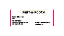
3. Rent-A-Pooch: This is a company where you can pick through the many selections of dogs they have available and rent them anytime you want. Food and maintenance will be a part of the package. There are different time frames that you can keep the pup. ex: a few hours, a couple days, or one month at the most. This is for the people that want to look cool with a dog but don't want to have that responsibility of owning a dog forever.
4. Rent-A-Baby: This is strictly for single males looking to pick up chicks. A baby will be available for a max of 6 hours a day. The male has only a few places to choose from to take the baby during that time. ex. the park, the grocery store, the mall. The male is guaranteed to pick up a chick during this time, and if not, a full refund will be provided.
5. Fart Silencer: This is something you simply clip on to your underwear that silences your farts. You can also get one that blocks the stench too, for an extra price of course. Sometimes you just can't hold them in, and you don't want to be embarrassed or have to point fingers at someone else.
6. RR Gone: This is a business which installs police lights and sirens on your car so whenever you are stuck in traffic and are about to get road rage, you just beep your horn and your lights and sirens go off, then everyone moves out of your way.
2. DD Anytime: This is a business that no matter where you are and what time it is, you are just a button away of obtaining a designated driver. All you do is press the number 3 on your phone, and a driver will be there. The only thing you have to do is give the driver the rest of your alcohol, as your payment.
3. Rent-A-Pooch: This is a company where you can pick through the many selections of dogs they have available and rent them anytime you want. Food and maintenance will be a part of the package. There are different time frames that you can keep the pup. ex: a few hours, a couple days, or one month at the most. This is for the people that want to look cool with a dog but don't want to have that responsibility of owning a dog forever.
4. Rent-A-Baby: This is strictly for single males looking to pick up chicks. A baby will be available for a max of 6 hours a day. The male has only a few places to choose from to take the baby during that time. ex. the park, the grocery store, the mall. The male is guaranteed to pick up a chick during this time, and if not, a full refund will be provided.
5. Fart Silencer: This is something you simply clip on to your underwear that silences your farts. You can also get one that blocks the stench too, for an extra price of course. Sometimes you just can't hold them in, and you don't want to be embarrassed or have to point fingers at someone else.
6. RR Gone: This is a business which installs police lights and sirens on your car so whenever you are stuck in traffic and are about to get road rage, you just beep your horn and your lights and sirens go off, then everyone moves out of your way.
Sunday, January 22, 2012
Hello Bloggers
I would like to start off by saying this is my first blog, as you can tell by the title, so I have absolutely no idea how to do this, so give me a break. This is for my beginning digital arts class so this shall be interesting...
My name is Suzie Sheeks, I'm 19 and I am a second semester freshman here at UT. I am not really enjoying college as much I would have hoped, but maybe it will get better. This semester I am one credit short of being a full time student, which I don't mind because I work ALOT. I work at my parents golfcourse, Cheval, as a waitress. I enjoy working more then I enjoy being a student, which may be different from most students... not that anyone cares... haha
What I hope to get out of this class is more experience in, well, digital arts. I hope to learn how to create visions of my imagination without them being stick figures or look like something that my 7 yr old god-daughter made. Honestly I took this class just for an art credit, but after the first day in class, and finding out what we are going to be doing/learning, I am pretty excited.
Here is a link to a video I made, im not sure if it is inapropriate, but I figure we are all adults and can handle this kind of humor. There is also a sequal to this video that I will post the link for right under. I also made a couple music video's which you could find on {jakejakejake1119} channel on youtube.
http://www.youtube.com/watch?v=m2G-MFXjnOQ&list=UUQ_im9mqmxcgjOJccEZtNlA&index=13&feature=plcp
Sequal:
http://www.youtube.com/watch?v=lfcwqLqH_Xk&feature=related
Subscribe to:
Posts (Atom)